Both this month’s layouts were inspired by Summer 2011 at Iroquois Springs camp. I thought I would post them today as a little 'Happy July 4th' to all my American friends!
Can you tell i’m feeling a little nostalgic? Last week was a hard one. While everyone was prepping for the kids to come, I was trying to fill my time so as not to think about everyone at orientation having a great time. Admittedly, there were a few tears.
I love these jumping photos of our leadership team from last summer. We were a great team-and mostly returners, having been at camp before. WE just worked. I miss the team.
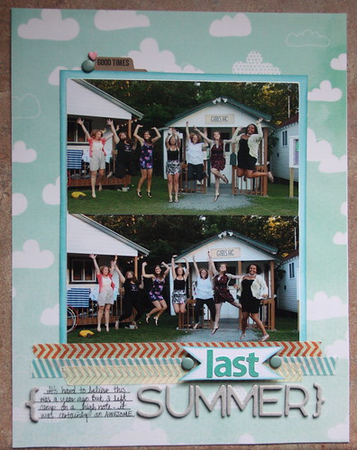
The title is kind of a double entendre- ‘last summer’ of course is Summer 2011 but it was also my ‘last summer’ at camp- at least for a while. I stuck with some simple washi tape and a little journaling on a few lines.
The products on this page are some of my favorites. I love that ‘Dear Lizzy’ velum paper and it took a while to find a layout that was worthy of it. I also love, love, love the naked AC chipboard letters I used for ‘summer’.
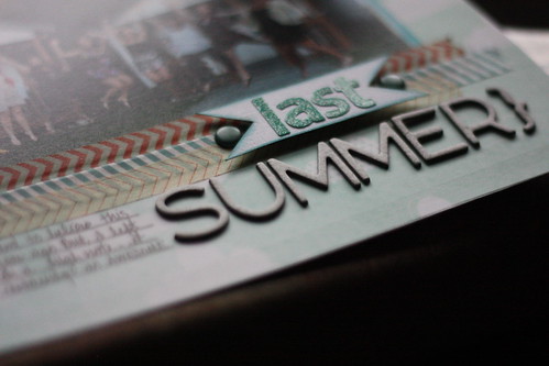
Another fav are is the kraft tab by ‘A Life Handmade’. I’ve been coveting the product I got from her shop.
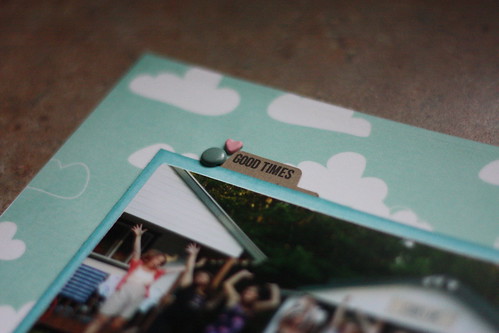
So that was my version of simple.
Then I started out with a great picture and a simple concept for this layout-
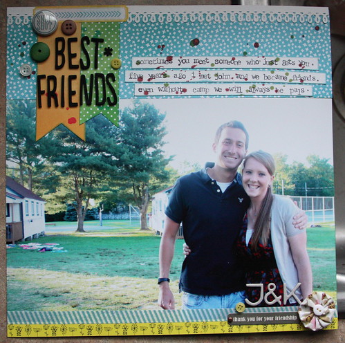
But it turned out a little more layered that I intended. I do however, love it.
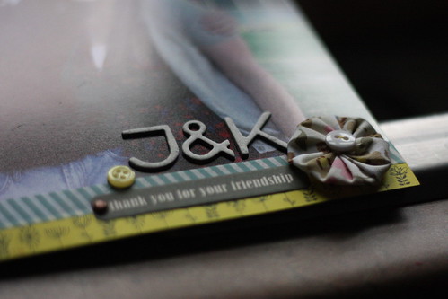
That’s John in the picture. John and I met 6 years at camp. It was my first year as a Group Leader and his first year at camp and something just clicked and we were instant friends. He’s always had my back at camp, and that first summer I needed it too. Neither of us are back at camp this year and I got a surprise phone call from him this past week. It was at a critical moment too-he seems to pop up whenever I need to hear form him. His phone call cheered me up on a dreary afternoon and it was just delightful. While I spend time at home this summer he’s off to travel the world for the next 5 weeks. I can’t wait to hear all about his adventures!
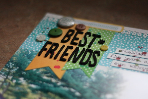
So for this one I used an 8 by 12 photo obviously. My title is grounded by a few pattern paper flags and it needed a little mist to give it a little something. You know when you know it needs a little something?! Yeah, that’s where the mist came from-also it mimics the watercolor in the flag pieces from the Amy Tangerine Sketchbook line.
I used those naked chipboard letters by AC again and a beautiful flower exclusive to an SC kit a few months back. That Jillibean Soup sticker label ‘thank you for your friendship’ was perfect for this page.
A few buttons-because I love them-and a badge with a little stamped label gave it a little flair above the title.
I’m sure these won’t be the last summer 2011 photos that I scrap this summer. Whatever I need for some therapy right?!
The Premium Membership at Simple Scrapper provides skills and shortcuts to help you simplify and find more meaning in your memory keeping.
xoxo
K

love both of this layouts!! and the alphabet is indeed awesome!!
ReplyDelete