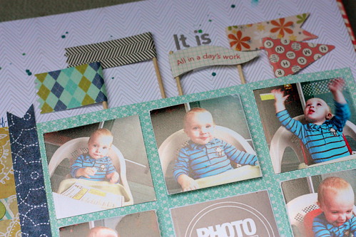
That's my little Liam. I got a sweet little video of him motoring around-he just started walking a few weeks ago-just the other day and thought it was high time I share a little layout of him.
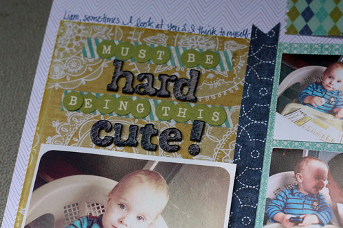
When Allison & Liam came to visit we had to go out for the obligatory fish & chips. We managed to squeeze it in on their last night. We visited The Duke and sat on the patio together. Liam kept himself entertained with the phone and menu-and just generally being cute. The waitress was enamoured-but how could you not be right?! Little bugger-must be hard being this cute.
My goal in this layout was to use up all those October afternoon flags.

I think they're the perfect accent to that grid of photos. I also used one of Ali Edwards digital files and create a little canvas in photoshop for the 'photo love' square which I just printed out as a picture when I did my developing.
The title was inspired by the Kelly Goree class I took.

Her layout titles are all about using more than one font. I thought I would highlight some words more than others in this title and love how it turned out. I even managed to stick in a little sub-title as well using one of the phrases on the flag-another little Kelly Goree tip I learned this past weekend!
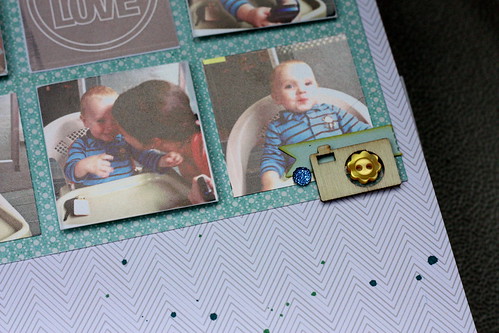
As for my embellishments I kept them simple-a little wood veneer camera and a few buttons here and there.

I LOVE this layout. It's colorful but well balanced. I love a good grid and using two fonts for a title might be my fav new thing!
xoxo
K

Love this! Those photos are adorable.
ReplyDeletefabulous!!! I love how you put the button in the camera veneer!
ReplyDeleteCute cute cute! Love all the flags across the top!!
ReplyDeleteI LOVE your use of the flags! I have tons of them in my stash, but I never know how to use them. Every once in a while I can fit one in on a card, but they just look out of place on my layouts. I'm going to try to scraplift this. =)
ReplyDeleteCute layout, love the photos :)
ReplyDelete