I've finished up those layouts and thought I would share them today.
The first one is bright but I love it.
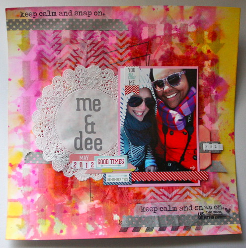
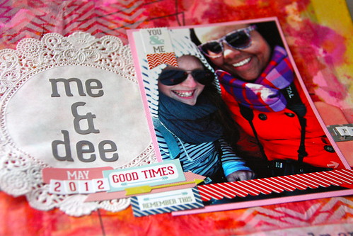
I'm not a doily fan but I was bound and determined to use it because it was in the kit. I also add some stickers from the Echo Park sticker sheet we got.
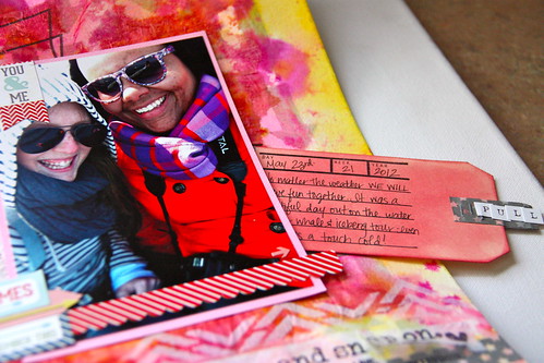
I added a stamp to the tag after inking it with Jenni Bowlin cough syrup and my ink blending tool for my journaling.
For the second layout I went much more muted with a mint background similar to the background Cathie created for the class.
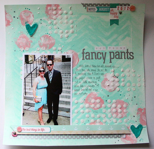
My favorite part of this layout is the dimension from stenciling the dots. It looks so cool in person. I added my journaling to that area to draw even more attention to it.
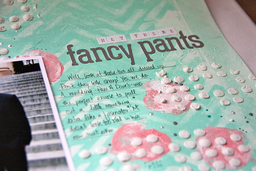
And a few more stickers made this layout complete.
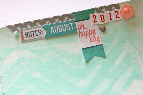
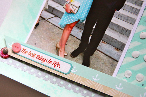
You may have noticed that on both layouts I only used one photo. I like to use lots of photos on a layout but in this case I felt like I didn't want to hide the mixed media that went into the background! It was a lot of work and I wanted to work around it so I could let it show.
One thing Cathie did mention while teaching her class was to think about the final result- a.k.a where you'll place your picture/story- so that you could work towards that. That was a good idea so I had in mind where I wanted to add my picture before I started.
I love the way these layouts turned out. What do you think? Are you into the mixed media/art journaling trend?
xoxo
K

Fun, fun! Loving all the background work on these~!!
ReplyDeletexErin
I love how these turned out and are so you. I am so glad you had fun in class and love that you finished them so quickly.
ReplyDeleteGorgeous Krista! Looking forward to what else you make with all these techniques!
ReplyDeleteThese are both really fun!
ReplyDelete