
Here's the result of all that time spent staring at the page.
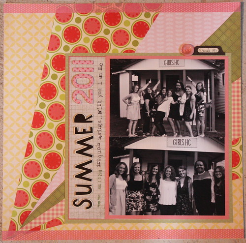
I used black and white photos because everything I tried in color just wasn't working-it was too overwhelming. Then I had to make a kind of canvas to go on the page. I tried something simple with an easy but 'fun' font for the title that kind of represents the feel of summer camp. I left the journaling to just one line.
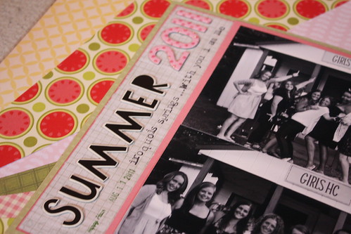
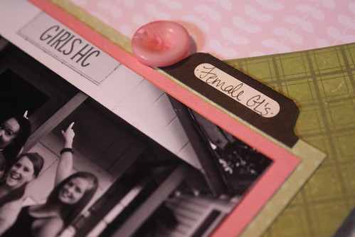
And a few close ups...
xoxo
K
It turned out great! Love the photos in black and white, it really lets the background stand out. Becky x
ReplyDeleteThis is great! I love what you did with the diagonal lines!
ReplyDeletegreat job! love the black and white versus the colorful background
ReplyDeletegreetz tanja
lovely layout...and i do think choosing the b/w photos was great for this colorful layout...
ReplyDeleteWell, all that time staring was totally worth it!
ReplyDeletegreat layout! love the combination of patterned papers.
ReplyDeleteLove the layout :) I totally dig the black and white photos!
ReplyDeleteThis is super cool! Love the Black and white photos
ReplyDeleteLove this-B&W was a great choice for that patterned paper!
ReplyDeleteGreat layout! The b&w photos play off the colourful background really well. I love that background you made by the way ~ so awesome.
ReplyDeletei love thelayout.. that startdust effect.. that what it reminds me of.. love it..
ReplyDelete