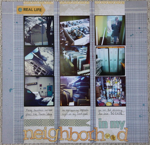
This one came together fairly easily using strips of photos from a recent trip to Power's Salvage, a very large salvage shop located in downtown St. John's. Honestly, I had no idea it existed until we moved into the neighborhood.

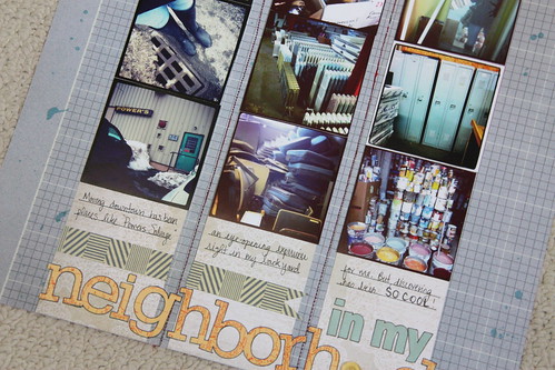
I used more of my Handmade kit-trying to use it all up. That grid paper is from Studio Calico and I love it. I stuck to neutral tones for the paper because I wanted my photos to really stand out against a plain background. The title letters are all from an older sticker sheet from Studio Calico as well- a summer travel theme from last year I believe. I didn't have enough 'o's so I used a few buttons instead. I also used my new Project Life stamps to stamp 'real life' onto a SC arrow for the top. I drew lines and wrote my journaling across the page.

The Premium Membership at Simple Scrapper provides skills and shortcuts to help you simplify and find more meaning in your memory keeping
In other news, this past week we painted, and painted and painted some more. You may remember that on Friday I posted a 'before' picture of our dining room that looked like this:

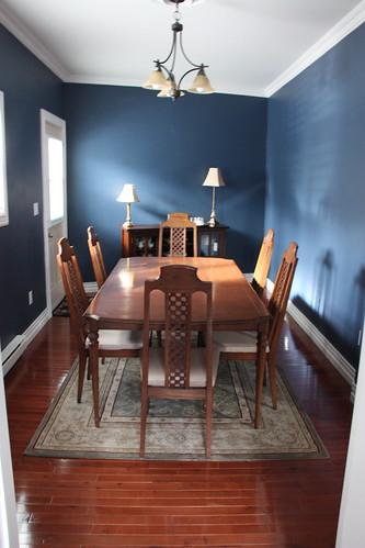
The walls actually had a peach undertone to them-they were pretty nasty truth be told. But, after some hard labor on my part the room looks like this:

If you are curious about the color it is Benjamin Moore Newburyport Blue. It's stunning in person. The dining room is not done by any means. I have plans for a silver mirror above the hutch at the back, a matching buffet lamp to the one on the right, a new rug and a lovely, locally made vase, along with a new chandelier. I'm going with a blue/magenta theme. I'll post pictures again when it's all finished!
xoxo
K

Love the color! It makes the table pop.
ReplyDeleteWOW!!! What a difference the navy color makes! Everything pops more. LOVE how the floor now makes it's own statement! Beautiful classy page as well. Greta layout with the photos!
ReplyDeletelove your layout--- and I REALLY LOVE that color-- I am always so afraid to go dark on my walls so I LOVE to see other homes and how they've been painted-- I really really like that blue, it is beautiful! Cant wait to see more =)
ReplyDeleteLove that layout. the itty bitty photos are a really cute touch. That navy for the walls are beautiful too!
ReplyDeleteGreat layout! Your colors choices were perfect for your photos!
ReplyDeleteI wish I had a salvage shop close by, they're awesome. I like the photo strips you used, they're perfect for that grid paper. Your dinning room looks beautiful, thats a great color. Are you going to paint the ceiling too?
ReplyDeleteThat color looks great and so does the page!
ReplyDeleteI love the blue, it's gorgeous!
ReplyDelete