Monday, June 2, 2014
A New Lease on Blogging.
It's been silent around here for some time now.
I've been working on a new blog for ages but it has been a long time developing. I wanted to go with a new aesthetic and even a new title. You can read a little more about the change over at my new blog which I hope you'll add to your blog roll.
Come check it out @
Hello Krista
See you over there!
xoxo
K
Saturday, March 29, 2014
Saturday DIY: That Wall
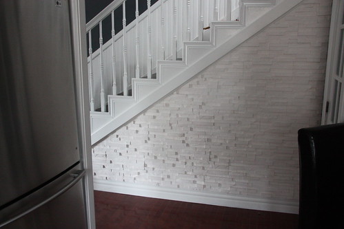
We've been working on a way to jazz up this wall under our stairs.
It took us three trys but we've finally gotten it right. Just goes to show that every DIY does not always go as planned despite what you see on the internet.
Try #1: Chalkboard Wall.
I was so excited to try this. I had visions of creating a menu when we had friends over for dinner-which happens often btw. And of course, messages left from said friends, etc.
So, I painted it. Left it for a few days as instructed. Chalked it up & then wiped it down.
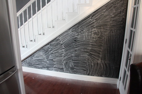
And wiped it down. And wiped it down. And wrote on it. And wiped it down. The darn thing never came clean. I'm not sure if it was the texture of the wall or what but it just looked dirty all the time.
Fail.
Try #2: Stencil.
I used my silhouette to create a stencil of Eugene, or a cocker spaniel. I had a vision. I tried it out using some plain white paint.
The stencil was too big and too close together. Not to mention that it wasn't nearly as crisp as I wanted it to be.
Fail.
Try #3: White faux-brick.
For the win.
So during a Saturday expedition to Kent we found this faux-brick material that's actually made of plaster. That makes it super easy to cut. So after hemming and hawing about it we grabbed three boxes and put them to work.
Four hours later, a lot of chalk & a decent amount of caulking we had ourselves a wall. We sprayed it down with a never-wet Rustoleum product to seal the plaster so it wouldn't crack or rub off.
And a little close up-
And we are in love.
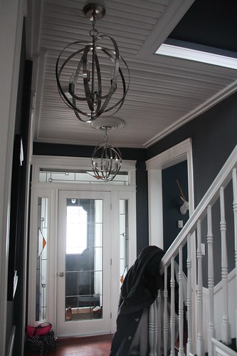
So naturally we upgraded the fixtures in the hallway too.
This was what we had up.
They were here when we moved in and while I have always liked the wrought iron I'm not a fan of the yellow-y lampshades.
So, we went modern with orbs.
Aren't they the most amazing? I love the orbs. They are simply awesome and take the whole hallway up a whole other notch!
xoxo
K
It took us three trys but we've finally gotten it right. Just goes to show that every DIY does not always go as planned despite what you see on the internet.
Try #1: Chalkboard Wall.
I was so excited to try this. I had visions of creating a menu when we had friends over for dinner-which happens often btw. And of course, messages left from said friends, etc.
So, I painted it. Left it for a few days as instructed. Chalked it up & then wiped it down.
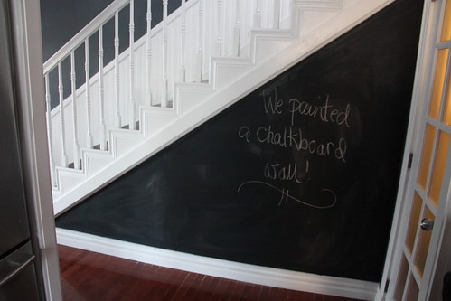
And wiped it down. And wiped it down. And wrote on it. And wiped it down. The darn thing never came clean. I'm not sure if it was the texture of the wall or what but it just looked dirty all the time.
Fail.
Try #2: Stencil.
I used my silhouette to create a stencil of Eugene, or a cocker spaniel. I had a vision. I tried it out using some plain white paint.
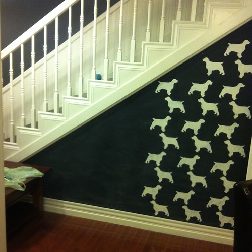
The stencil was too big and too close together. Not to mention that it wasn't nearly as crisp as I wanted it to be.
Fail.
Try #3: White faux-brick.
For the win.
So during a Saturday expedition to Kent we found this faux-brick material that's actually made of plaster. That makes it super easy to cut. So after hemming and hawing about it we grabbed three boxes and put them to work.
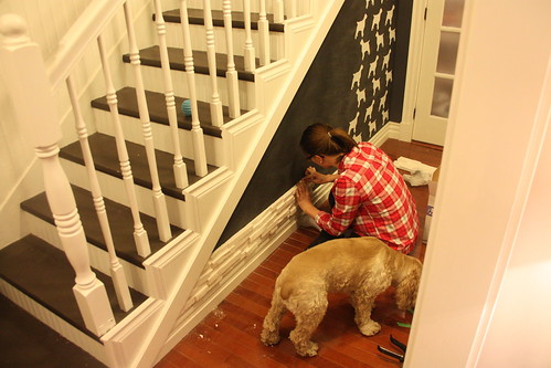
Four hours later, a lot of chalk & a decent amount of caulking we had ourselves a wall. We sprayed it down with a never-wet Rustoleum product to seal the plaster so it wouldn't crack or rub off.
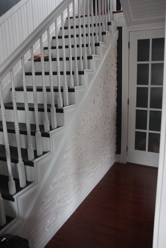
And a little close up-
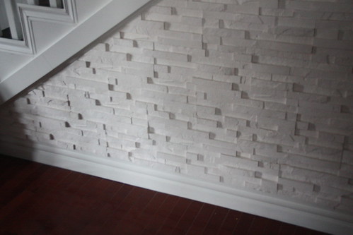
And we are in love.
So naturally we upgraded the fixtures in the hallway too.
This was what we had up.
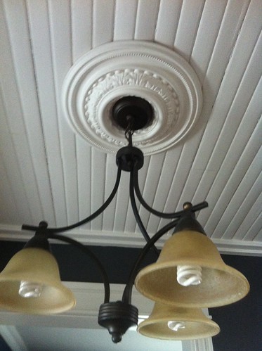
They were here when we moved in and while I have always liked the wrought iron I'm not a fan of the yellow-y lampshades.
So, we went modern with orbs.
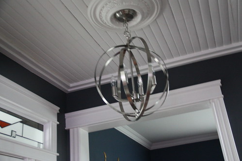
Aren't they the most amazing? I love the orbs. They are simply awesome and take the whole hallway up a whole other notch!
xoxo
K
Tuesday, March 25, 2014
The Paperie: February KTOL
*Each month I do a class called 'Keeping Track of Life' or KTOL at my local store The Paperie.
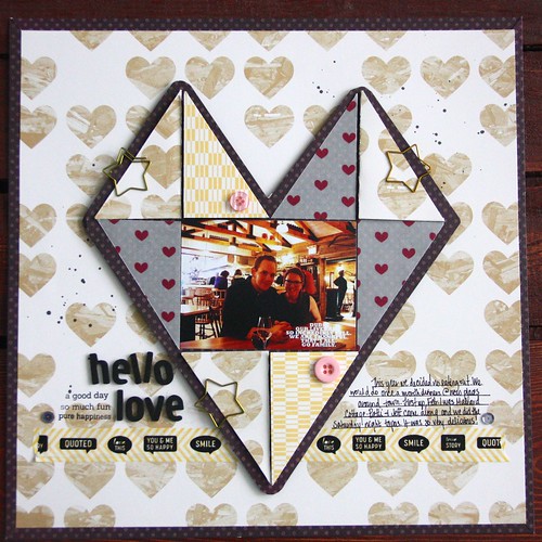
This month I went with a 'heart' theme inspired by a picture I saw on- where else- Pinterest, for the interactive layout.
The three papers with the paperclips are triangles that fold out to reveal more photos.
I used pictures from our visit to Mallard Cottage February 1st with our friends. Conveniently, it was also our anniversary-dating not wedding anniversary. 11 years. Go us! Our meal was delicious & the company was pretty awesome too!
For the pocket page I used a simple piece of vellum for the date card, which I wanted to be in the centre of the layout so I let it span two of the 3" by 4" pockets.
It was another great month around here!
xoxo
K
Monday, March 24, 2014
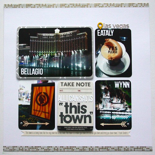
This Town
The weather around here has been cold and dreary. Dude I am so ready for Spring.
I'm actually ready for summer-or at least summer weather. So, I'm reliving our trip to Vegas in november when it was 25 during the day and a balmy 15 at night. Those were some lovely days.
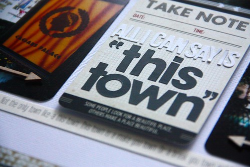
I took my friend Rae Lynn's advice on this layout and used up a project life card for my title. It's a great way to use leftover or favourite cards on layouts. They aren't just great for PL spreads. Check out her class at The Paperie this month for using PL cards in layouts!
Now, onto the layout. The title card is obviously a reference to Frank Sinatra's 'This Town'. I do love that song. And it's Vegas personified in my opinion. Also, it was featured in ocean's & we know how I feel about those movies.
Just a simple layout with some leftover pics that didn't make it into my travel album. I realized I made a mistake and put 'Eataly' on the card with the Olive Oil Gelato from Otto. Oops. Mario Batali just has so many restaurants going on. Maybe he should open up an Eataly there too!? Have to fix that little flub I guess.
I'm hoping to share the travel album next week with some tips on using project life products & project life-style spreads for travel albums.
xoxo
K
Sunday, March 23, 2014
Sunday Reads
So last Wednesday was an awesome day for the internet. Or at least, it was for my blog roll. Some of my favourite bloggers have been knocking it out of the park lately with content and I really feel as though interesting content makes for an awesome,worthy-of-my-time blog.
So, if you're enjoying a lazy moment this Sunday check out some of these links for a few good reads. Enjoy!
1. Ann-Marie Loves: on free-lancing
2. A Beautiful Mess : on young industries
3. Elise Blaha-Cripe: on tackling huge projects
4. Merrick's Art: on bulding a spring wardrobe
Such great reads this week. You're killin' it ladies. Keep up the good work!
xoxo
K
Labels:
A Beautiful Mess,
anne-marie loves,
bloggers,
Elisejoy,
marrick'sart,
Sunday Reads
Subscribe to:
Posts (Atom)