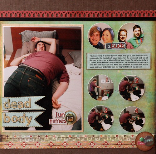
So here it is. I used the Who's Who kit from Studio Calico.

The layout above and this layout are a perfect example of how versatile these kits can be. If you take a look at both layouts you'll notice they have some similar things in common but there were two totally different layouts that came out of that packet of supplies. Pretty cool huh?!
So I tried something a little different in this layout. I changed up my photos a little and used a 6*8 for my focal point and punched 6 circles out of 2*3 photos. I was channeling Susan Weinroth with this design. That girl loves circles!

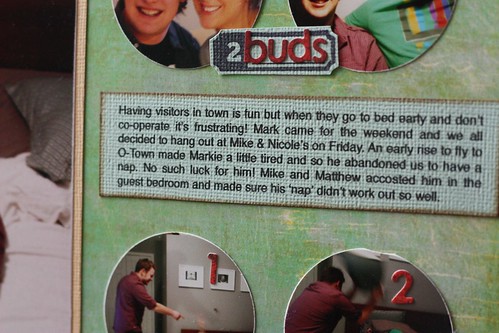
I broke up my circle photos into two sections-a few posed shots on top of the journaling block and some sequenced action shots below. I also aimed to place them in a grid-like format. I really focused on design with this layout.
xoxo
K

Totally cute! And yes, I totally see the Susan influence here. TFS!!!
ReplyDeleteI love how you did your title on this!
ReplyDeletelol, love the large pic!
ReplyDeletenice layout!! great job
ReplyDeleteGreat layout. It looks like a lot of fun goes on around there!
ReplyDeleteGreat layout! Funny pics!
ReplyDeleteFunny pics! Great layout!
ReplyDelete