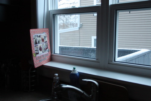
It was, thankfully, the only place to get some good lighting yesterday evening. Take a look at this...

Yeah. That's how I photographed the layout-what you don't know is I propped that guy up against a Gatorade bottle. To get it to 'sit up' and be photographed. The things we do for blogging and scrapbooking.
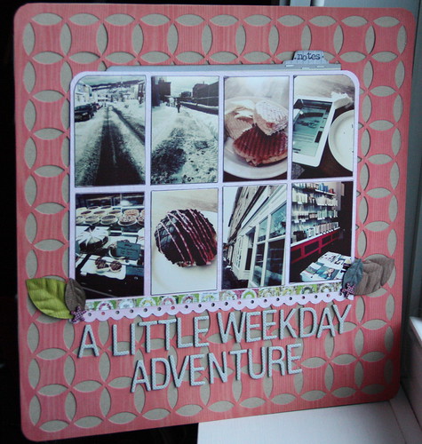
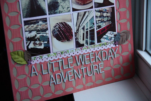
More Amy Tangerine product in this layout from the 'Handmade kit' from Studio Calico. More of those beautiful Thickers with the most perfect grid and those cute little leaves! Honestly, I had no idea what to do with that die cut paper by Studio Calico but then I pulled out my cardstock and thought 'Why not just stick it on top of one of them?" and so I did. And it worked out well.

This layout is just even and symmetrical. I added some journaling on the little tabbed 'notes' piece behind the collage. I love hidden journaling and the story behind these pictures was a little more personal so I didn't want everyone to be able to read it.

You may be wondering about the photos themselves. I used the Pioneer Woman's 'vintage' action in PSE 8 to get that cool 70's vibe in the pics. Love that action. They are free if you want to add a few to your Photoshop Program.
It's hump day and we're halfway through the week. I'm working all week this week and I had forgotten what it's like to teach all day every day. I'm exhausted and the kids I'm working with are giving me a run for my money! But, it's good to be in the classroom!
Happy hump day!
xoxo
K

cool layout!!!
ReplyDeleteLove how you used that diecut paper! I have it and didn't know what to do with it, but seeing it in action helps.
ReplyDeleteGreat layout! Love the clean lines with the die-cut background.
ReplyDeleteLove all the photos you have on there. Super cute!
ReplyDeletelove how you used the diecut paper - really makes it the focal point. thanks for the tip about the action. I'm going to check it out.
ReplyDeleteCool page! Love the look you gave your pics!
ReplyDeleteI often have to shoot my projects that way. :) Very limited light in my apartment windows- this week has been great with the sunny weather in NYC. I really love the photography and the grid layout of the page- layering that die cut paper was a fantastic idea- it really makes it sing- I've seen lots of people cut it up or layer it- it's nice to see it in showcased
ReplyDeleteI love how you used the die cut paper, Krista! Beautiful!
ReplyDeleteI love this layout... thanks for sharing.
ReplyDeletelove how you used that paper! it's raining here & it's way hard to get good layout pics lol i feel your pain!
ReplyDeletexo
how awesome! I guess I'm spoiled with all the sunshine where I live lol
ReplyDeleteThat background totally rocks!!! Great way to add depth without too much dimension.
ReplyDeleteI love this layout, and how you photographed it. :)
ReplyDeletewow. i had never considered using that paper for a background but it looks great. too bad I already cut mine all up!
ReplyDeleteI love this page!!
ReplyDeleteI totally love this page! Every little thing about it! The colours, the font of the Thickers, the background... It looks great :)
ReplyDelete