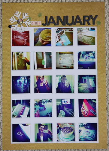
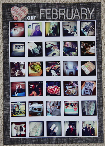
I loved the look and wanted to replicate something similar for my Project Life album.
Here's what I came up with while cropping with the girls on Friday night:
January

February

I had the pictures printed on an 8 by 10 photo print from my local developer and then cropped it to fit my paper nicely. I ended up going with an 8.5 by 12 page rather than 8.5 by 11. That extra inch really made a difference in the space for my titles at the top.
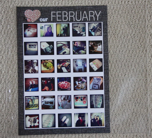
I've given some thought to what kind of page protector I want to put it in and I think I'm going to use a 12 by 12 protector and then just sew down the side of it and add some 'highlight' notes to a piece of cardstock to add to the other section.
Here's what it looks like-sorry the pic isn't great-in the page protector.

I was a much busier 'instagramer' in February than January-I actually had to cut down a few pics in order to fit in this many! Turns out I LOVE instagram according to my iphoto program! But, really this kind of collage is a great way to see your 'month at a glance'.
Still not sure what I'm putting on the other side of these collage page protectors! I'm thinking something very simple but I'm up to hearing suggestions?! What would you put in that little section to the right?! Or would you move the layout to the left and use that side?! decisions, decisions!
Have a great day!
xoxo
K

Really love this idea- especially your idea with the page protector. Super cute!
ReplyDeleteLove these layouts - such a great visual representation of the month. Maybe use the other pocket to add any journalling related to specific images?
ReplyDeleteOr just cut the extra off to have a narrower insert and leave the pics to stand on their own? Love how these turned out - they look awesome!
ReplyDeleteLove this idea.
ReplyDeleteI love Instagram! This is a great way to display them.
ReplyDeleteI'd just trim off the excess or if you don't want to do that-put in a monochromatic paper with a small label or banner with dates of the week?
ReplyDeleteBeautiful monthly layout. Love all of the pics in a grid. well done. Maybe put lots of confetti on the side and sew along the top? Or even larger cut outs like 3 or 4 large stars?
ReplyDeleteIt's a sweet idea to do it monthly! It seems quicker and is still a great way to keep your memories :)
ReplyDeleteWhat a great idea! Love your website and blog so much. I have awarded you with the Liebster award!! http://scrapbookingbyjess.blogspot.ca/2012/03/liebster-blog-award.html
ReplyDeletefantastic!
ReplyDelete