So when the March kit from The Paperie landed in my hands I challenged myself to do something different. So, 8 1/2 by 11 it was.
I created two pages-both simple.

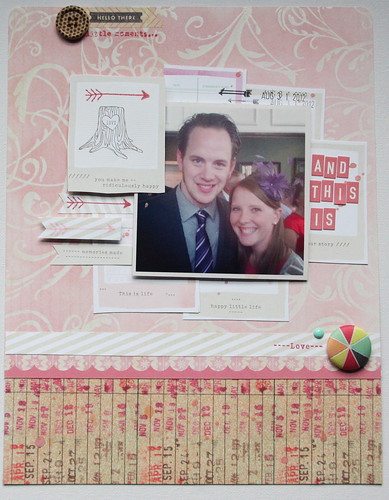
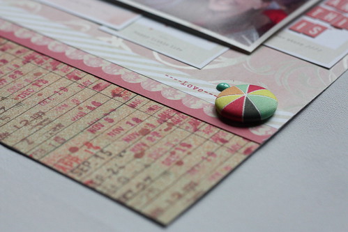
I did a little layering here but stuck with a single 4 by 4 photo. I love all the pink nd the pop of pastels in the Crate Paper brad and the enamel dot. This photo was taken at a wedding we attended in August. Yes, I am wearing a fascinator. Yes, it's amazing, I know!

Then I made this one...

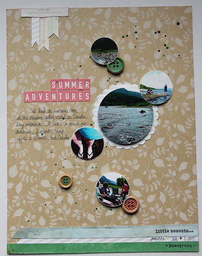
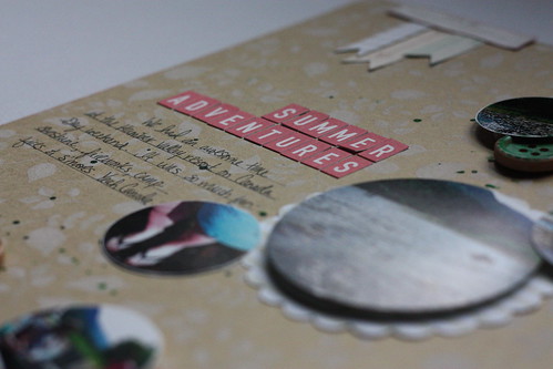
Another simple one. I love the kraft printed background. I wanted to create a whimsical smattering of circles and between punching the photos into circles, adding a few mist splatters and then some buttons for dimension I think I'm happy with what I came up with. The pics are from July 1st weekend last summer at a NL resort. We had a blast celebrating Canada's birthday!

So here's the verdict. I like 8 1/2 by 11 because you can certainly get them done faster-there's less space to work with. But, that does also make it hard to fit a whole bunch of pictures on it. Even though I managed to do that in the second layout.
Hmmmm, okay so maybe I need to try my hand at a few more 'rectangle' layouts?!
xoxo
K

nice i really love both layout oh so simple and oh very nice.. love the circle photos nice touch..thanks for sharing ..
ReplyDelete